Friday, October 27, 2006

information architecture

You can download my report at :http://www.box.net/public/vo4hrf5vo3

Friday, October 20, 2006

How architects think

Daniel asked me to introduce to the class how architects think about space and flow of people with the view of next week task.
Vast question!
starting point:
Have a look at the video made by graffitiresearchlab (GRL) on http://graffitiresearchlab.com/?page_id=32#video, and many other projects of co-ooperativeof artists. (My favorite nes are theLED throwies)


Examples of architects working with interaction design.
They're well hidden!
Frst one, god himself: Rem Koolhaas!
Seattle Public Library. The artist george Legrady made "make the invisible visible": An installation of 6 plasma screens behind the main librarians' desk in the Mixing Chamber area of the library features visualizations that are based on statistical analyses of the circulation of non-fiction books catalogued according to the Dewey decimal system going in and out of the library's collection.
for more informatin go to http://www.georgelegrady.com/
in Prada stores. No images available, Prada is the height of luxury and so the space is deserved for those who step across the treshold.
for more informatin read the very interesting book projects for PRADA, Part 1, (paper back 2001)OMA/AMO, Rem Koolhaas, Miuccia Prada, and Patrizio Bertelli (available at the library of AHO).

Superflex is the second example of graphist-architect-designer-programmer. They build a copy of the town of Karlskrona and allowed the inhabitants to play in the virtual space. Have a look at http://www.superflex.net/tools/supercity/karlskrona2/
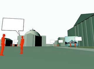


Regarding all these examples of what interactive architecture can be, from a video projection on a wall to a completly virtual city, I feel that this field is making its very first steps. It's expanding in every direction, mostly held by artists at present time, and as it was very hard to find architects working with this huge revolution, I still hope it will be embedded more and more in their work.
I would end this presentation by quoting this definition from Davd McCullough in Digital Ground of interaction design: "My claims about architecture are indirect because the design challenge for pervasive computing is more directly a question of interaction design. This growing field studies how people deal with technology-and how people deal with each other, through technology." As technology is a growing part of our lives I found this defintion completely appropriate to architecture too. What matters in architecture is not the flow of people taken appart but really what the building will be designed for. I've been teached to always ask the question of the use of the building, how the activity which will take place in and evolve. How the design can take it into account and even make the activity evolve. The theme presence is the lowest level of human activity in a building. Ask space within human activities: what is this building made for? How is it used? what make this place a place where you learn? How are we learning in? what was the vision/intention of the architect?
For instance the wireless technology and the impact on flow of people and teaching method in a school or how to renew the definition of luxury in Prada stores when everything has become shopping.

Project of interaction in the city

Have a look on www.research.urbantapestries.net
And also www.dodgeball.com to interact with your friends, if your are living in the USA.

Thursday, October 19, 2006

Wonderful geek!


I am talking about Pål who is the first geek I have ever approached. After VirtueDesktops (hit your screen to change the application, it is as simple as a slap!), iAlertU (use the apple remote as the keys of your car, the laptop bips and if someone tries to steal it, the alarm is activated and you can also have a picture of the thief) and so many others.
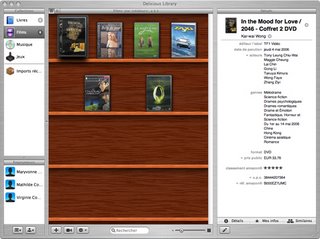
His new baby is delicious library: http://www.delicious-monster.com: to me the most advanced tool to make your christmas list, grab your dream games, books, Cds and movies and show the source code to the webcam and you have already all the informations concerning the item.

How architects think

Daniel asked me to introduce to the class how architects think about space and flow of people with the view of next week task.
Vast question!
starting point:
Have a look at the video made by graffitiresearchlab (GRL) on http://graffitiresearchlab.com/?page_id=32#video, and many other projects of co-ooperativeof artists. (My favorite nes are theLED throwies)


Examples of architects working with interaction design.
They're well hidden!
Frst one, god himself: Rem Koolhaas!
Seattle Public Library. The artist george Legrady made "make the invisible visible": An installation of 6 plasma screens behind the main librarians' desk in the Mixing Chamber area of the library features visualizations that are based on statistical analyses of the circulation of non-fiction books catalogued according to the Dewey decimal system going in and out of the library's collection.
for more informatin go to http://www.georgelegrady.com/
in Prada stores. No images available, Prada is the height of luxury and so the space is deserved for those who step across the treshold.
for more informatin read the very interesting book projects for PRADA, Part 1, (paper back 2001)OMA/AMO, Rem Koolhaas, Miuccia Prada, and Patrizio Bertelli (available at the library of AHO).

Superflex is the second example of graphist-architect-designer-programmer. They build a copy of the town of Karlskrona and allowed the inhabitants to play in the virtual space. Have a look at http://www.superflex.net/tools/supercity/karlskrona2/


Regarding all these examples of what interactive architecture can be, from a video projection on a wall to a completly virtual city, I feel that this field is making its very first steps. It's expanding in every direction, mostly held by artists at present time, and as it was very hard to find architects working with this huge revolution, I still hope it will be embedded more and more in their work.
I would end this presentation by quoting this definition from Davd McCullough in Digital Ground of interaction design: "My claims about architecture are indirect because the design challenge for pervasive computing is more directly a question of interaction design. This growing field studies how people deal with technology-and how people deal with each other, through technology." As technology is a growing part of our lives I found this defintion completely appropriate to architecture too. What matters in architecture is not the flow of people taken appart but really what the building will be designed for. I've been teached to always ask the question of the use of the building, how the activity which will take place in and evolve. How the design can take it into account and even make the activity evolve. The theme presence is the lowest level of human activity in a building. Ask space within human activities: what is this building made for? How is it used? what make this place a place where you learn? How are we learning in? what was the vision/intention of the architect?
For instance the wireless technology and the impact on flow of people and teaching method in a school or how to renew the definition of luxury in Prada stores when everything has become shopping.

Tuesday, October 17, 2006

Lovetann

In the latest issue of Blueprint there is an article on Lovetann, for those interested...

Monday, October 16, 2006

Nothing more than that

I found the homepage of pradaparfums.com very elegant though very simple. The content is very light, as expected, maybe, for fragrances.

Monday, October 09, 2006


video game presentation(two intense weeks ending)

Many many things and new ideas coming from the class at the end of the presentation: sound, body feedback, different enemies according to the levels, ...
That's a good sign, the game seems to inspire a lot of people. It was our state of mind during two weeks but coming to the end of the task I had the feeling that too many things could be so much nicer. That's the other side of the coin of working on a "high-potential idea" with a so short period of time. Compared to what we already presented on monday and on thursday and the many possible directions, I wonder if I was right to enhance again and again the action-reaction between the different actors of the game. By hearing the suggestions the audience made about the sound I realised that one week ago I was also and already eager to hear this kind of feedback. It came after in the priority list and regarding backward I wonder if it was a good idea. The work on the reactions had to be done, but regarding the time left, I should have expected nothing would be perfect, in my opinion I'd better spare time to explore other fields like the music or the set up. As Daniel said, keeping the abstraction is very important and allows then more liberty in the aesthetic of the set. I would have loved to have one more week to go deeper in this aesthetic of black and white photographs. This was what I was attracted by in the interactive toy and thanks to the talent of Una I now dream of whole stylish video games.